Everyday clarity
Make common banking tasks easier to find, understand and complete.
Modernizing a large-scale mobile banking experience to make everyday financial tasks clearer, faster and easier to complete.
This project can showcase consumer mobile product design inside a highly regulated financial-services environment, balancing usability improvements with the consistency and trust expected from a major banking product.
Make common banking tasks easier to find, understand and complete.
Create patterns that can scale across a broad mobile banking ecosystem.
Improve the experience in high-frequency moments while supporting larger platform consistency.
The redesigned mobile experience brought essential account information and everyday banking actions into a more consistent, easier-to-navigate interface. These screens show how clearer hierarchy, familiar patterns and focused interactions helped members move through their financial tasks.
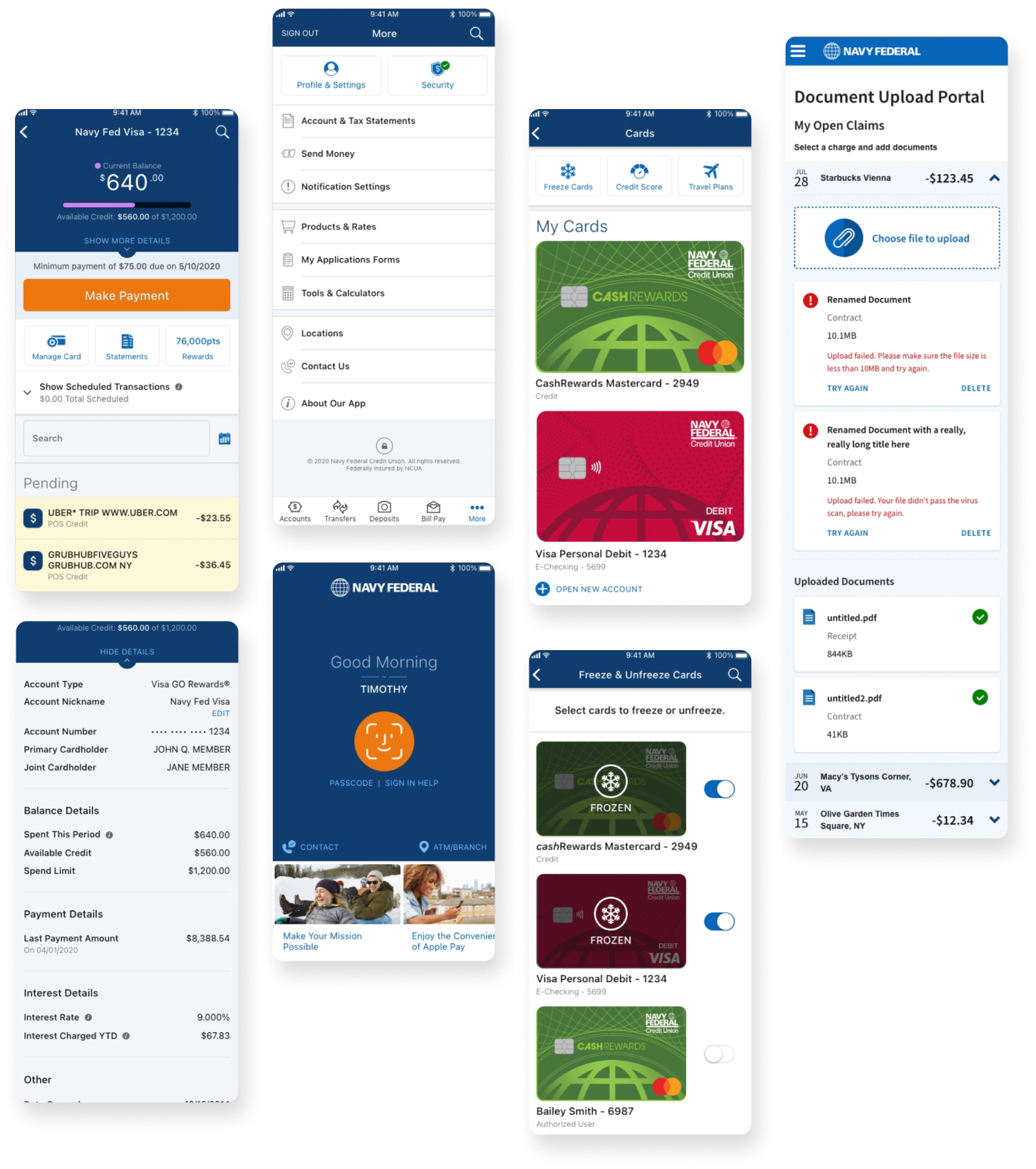
Across core mobile journeys, the design prioritized readable account details, recognizable actions and consistent navigation—helping members understand where they are and what to do next without unnecessary friction.
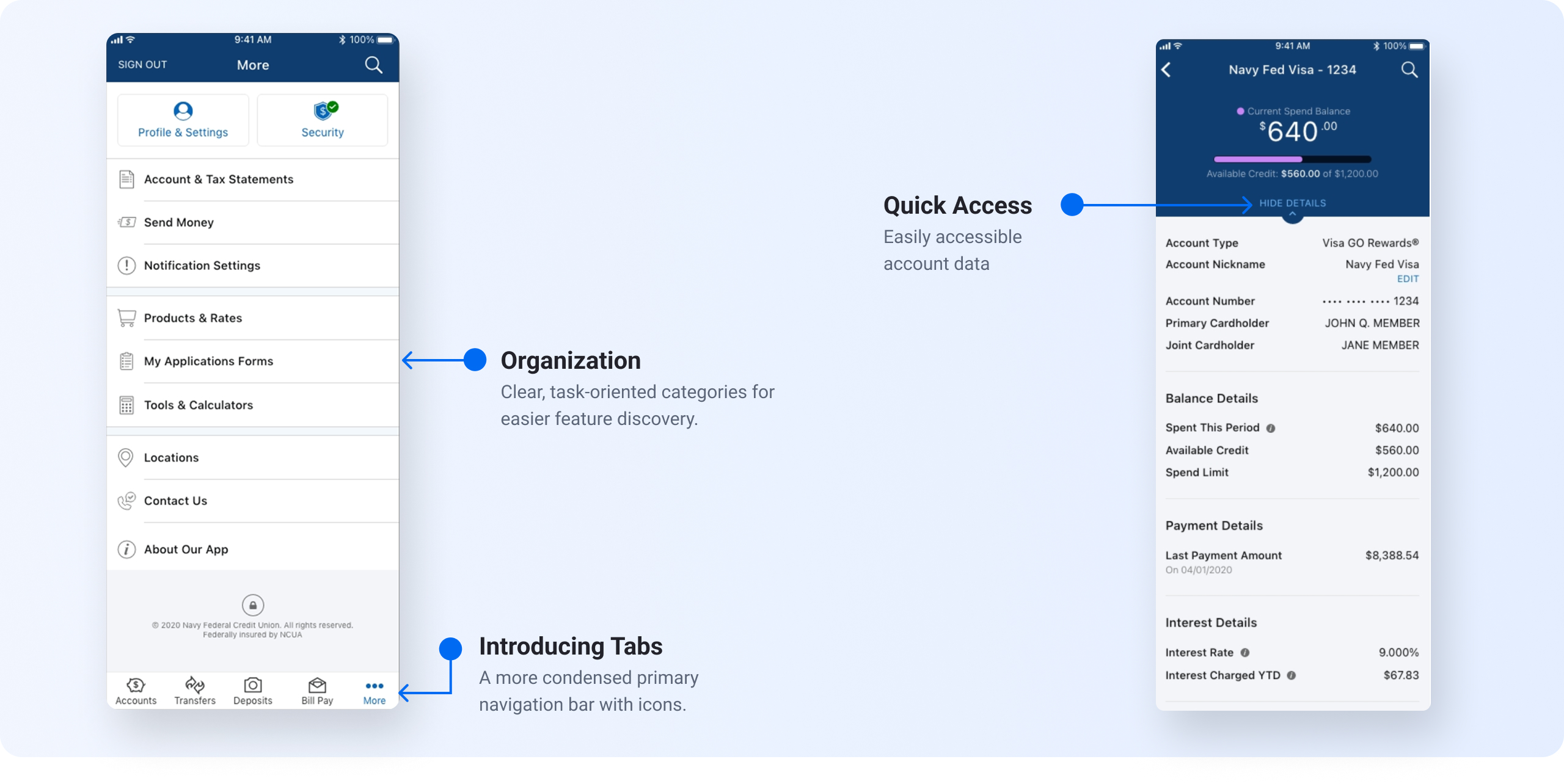
A shared set of navigation, content and interaction patterns helped unify screens across the app. The examples below show how reusable UI decisions can support familiar behavior, clearer information hierarchy and a more cohesive mobile experience.
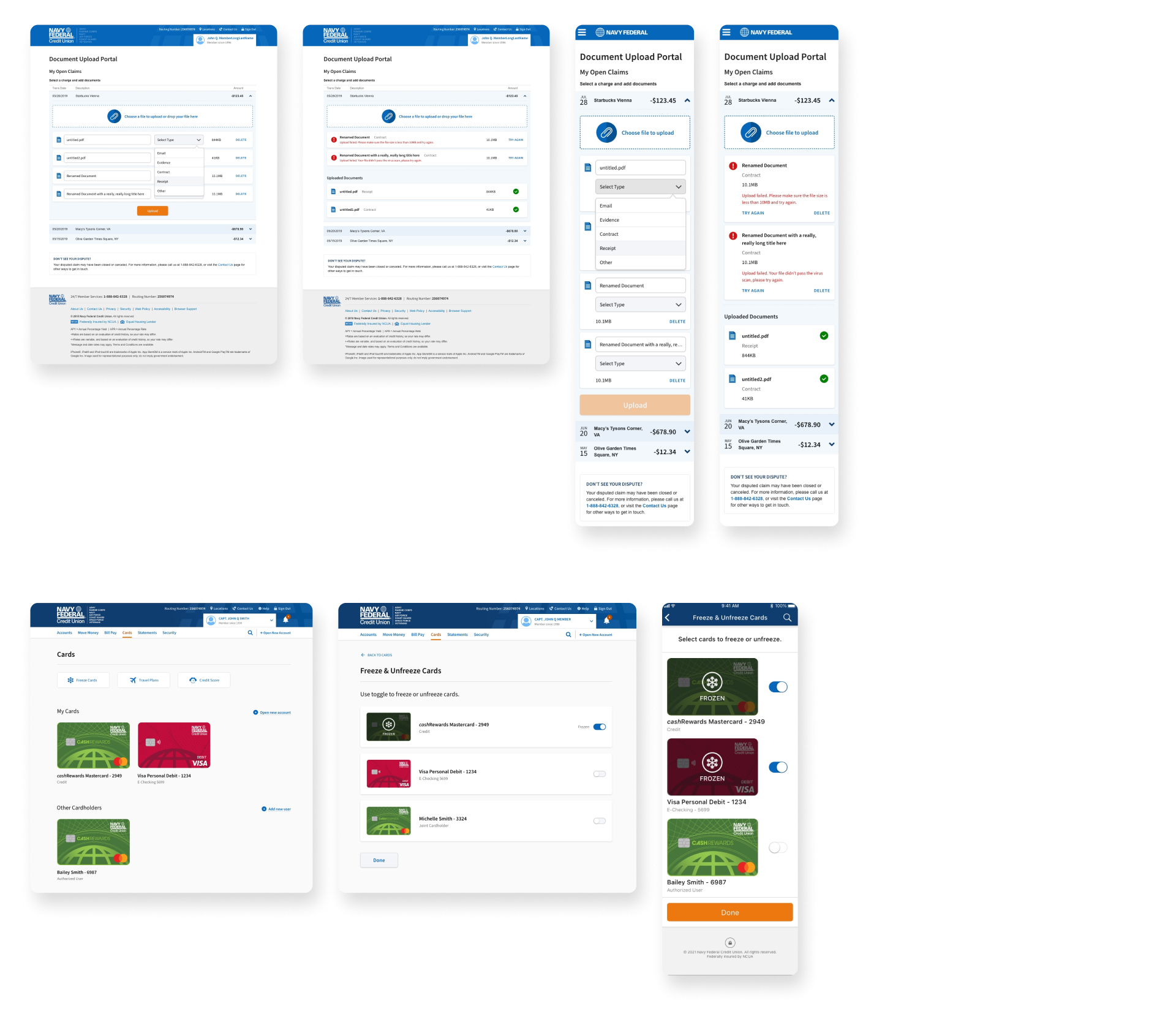
The redesigned experience was associated with higher engagement, faster completion of everyday tasks and fewer navigation-related support requests. These outcomes reflect the impact of clearer flows and a more consistent mobile interface.
increase in active users driven by improved navigation and streamlined task flows
faster task completion
reduction in customer support queries related to app navigation
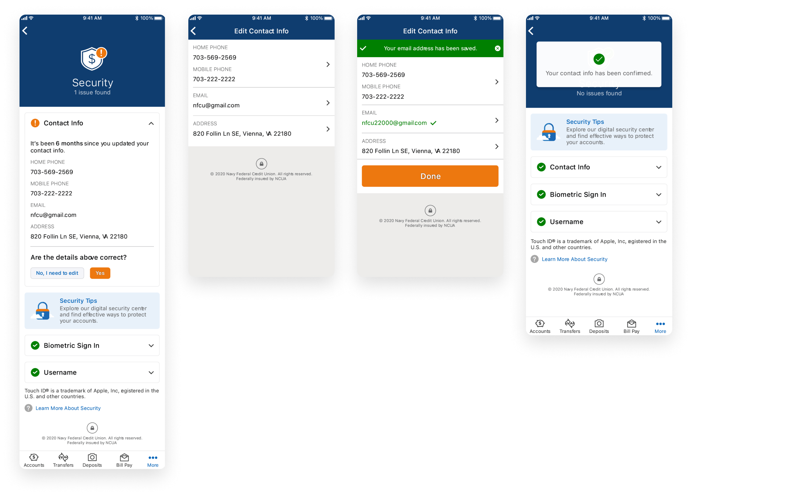
One of the stronger additions to the Navy Federal experience was a Security Center designed to make security information more visible and actionable. Rather than only surfacing security when something went wrong, the experience helped members review the information on file, confirm that it was still correct, and update anything that needed attention.
Give members a dedicated place to understand the information and settings tied to account protection.
Prompt users to verify stored contact or security-related information instead of assuming it is still accurate.
Provide a clear path to correct information when something has changed or no longer looks right.